Art Direction + Brand Identity + Digital and Print Materials
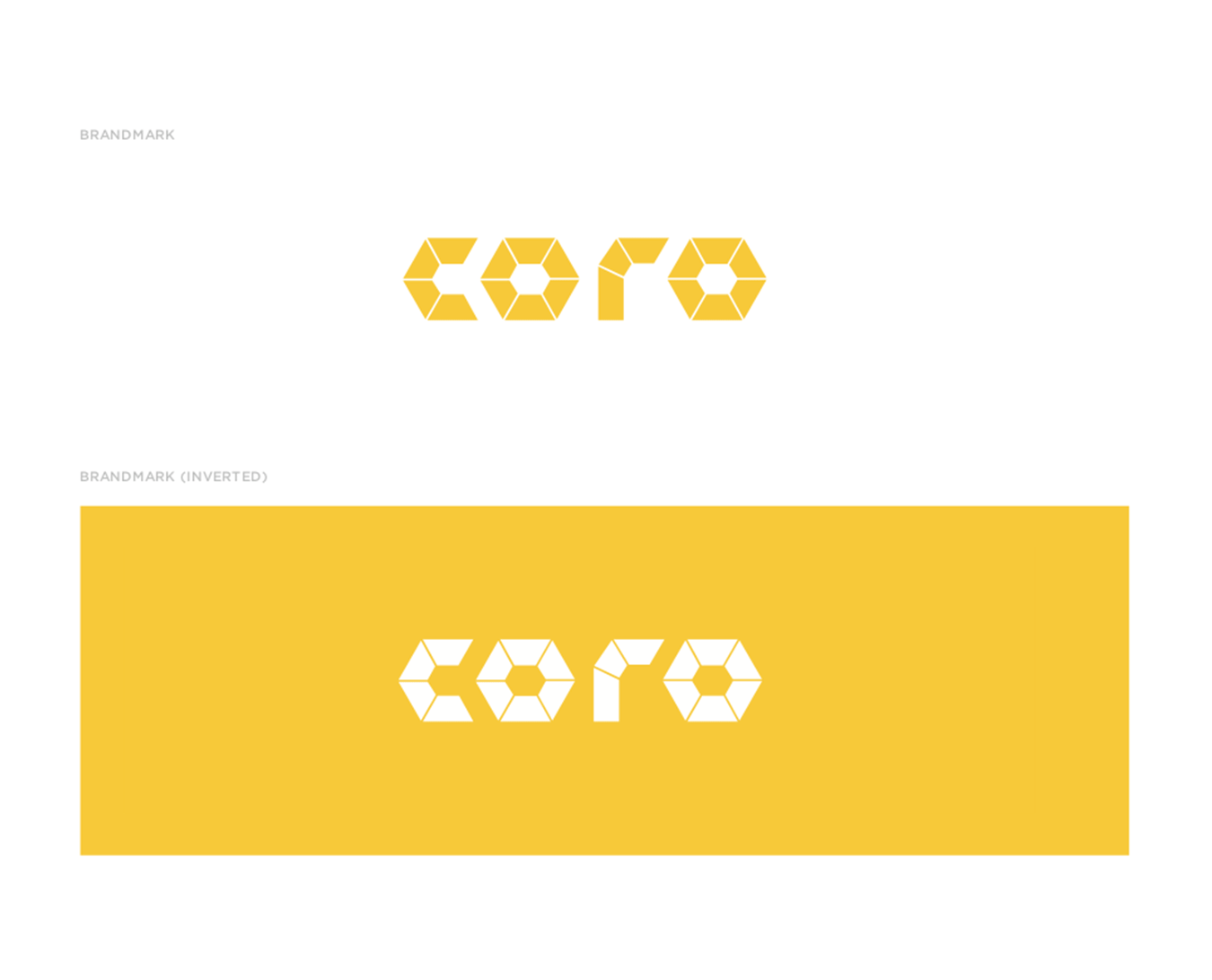
The name Coro draws inspiration from the word “Oro”, meaning gold in Spanish. The wordmark is created using a custom typeface. Various pieces come together to form the wordmark and resemble individual pieces of gold, with a hint of digital. The yellow color also communicates value and optimism.
Coro is a new platform to provide a universal currency for everyone. Coro believes that fair and transparent financial transactions can foster a better, more stable world where individuals thrive.
Agency: REQ
Client: Hash Labs